
With traffic of all types (SEO, PPC and referrals) becoming more expensive and difficult to get, conversion rate optimization is becoming more important than ever. Doubling website traffic is becoming way more expensive than doubling conversion rate, and both of them can lead to the same objective which is more sales or leads.
CRO is defined as: "Conversion rate optimization seeks to increase the percentage of website visitors that take a specific action (often submitting a web form, making a purchase, signing up for a trial, etc.)", this could be done by applying human behavior principles to website elements and methodically testing alternate versions of a page or process to find which version generates the best results. In doing so, businesses are able to generate more leads or sales without spending more money on website traffic, that will result in increasing their marketing return on investment and overall profitability.
Human Behavior:
It is very important to understand that big part of CRO is understanding human behaviour and what signals or triggers lead humans to take certain actions. Fogg behaviour model is one of the most popular models that can help us a lot to understand how humans take actions, see the chart below:
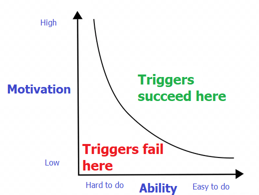
The model in a nutshell suggests that humans likelihood to take a certain action rely heavily on the motivation and the difficulty of taking that action.
Core motivations:
- Pleasure / pain
- Hope / fear
- Social acceptance / rejection
Ability Variables:
- Time, does it take a long time? Does it worth my time.
- Money, can I afford it? Does it worth it?
- Physical effort, do I need to leave my house to do it?
- Non-routine, can I do this my usual way?
So when optimizing a website for a better conversion rate make sure any improvements you make can either:
- Increase users motivation to take an action.
- Make it easy for users to take an action.
There is another model that you can have a look at called the Lift Model.
Conversion Tracking Setup:
"If you can not measure it, you can not improve it", deciding the right KPIs and setting up goals (possibly events also) to track them is vital for CRO, having an analytics software (i.e. Google Analytics) installed on the website is a must in order to set up goals to track the KPIs. Try to track as many actions as possible, tracking is not retroactive in Google Analytics, it is better to have more than less. Divide the goals into hard and soft goals.
The KPIs that could be measured are almost infinite, here’s a list of the most popular KPIs to track on a website:
- Form submissions.
- Cart abandonment rate.
- Checkout conversions.
- Traffic to sales pages.
- Unique visitors.
- Returning visitors.
- Scroll depth.
- Time on page.
- Phone calls.
- Funnels.
- Form dropoff.
Many of the KPIs above are tracked by default in Google Analytics, however there are many others that need to be manually set up.
Have a KPI discussion with the client and understand their business model, based on that create a list of hard and soft goals that need to be tracked.
How to start a CRO audit:
A CRO audit relies heavily on studying user behaviour then making changes to web assets then finding if those changes improved conversion rate, the best tools that can help with that are:
- Mouse tracking (could be done using Hotjar)
- User journey tracking (Could be done using Google Analytics)
- A-B testing (could be done using Google Optimizer)
The three tools above are not easy nor cheap to run, if you are facing a low budget situation the only way to do CRO is what I call "CRO Fundamentals Audit" which is simply running the website against a check list of CRO fundamentals >> then evaluate the website against each of them >> then make recommendations.
In this post I will provide you with a step by step guide to check the CRO fundamentals and create an essential CRO audit.
Essential CRO Audit - Sep by step:
This guide will assume that Google analytics is installed with a long enough history of goal tracking (soft goals and hard goals). Based on the most popular human behaviour models I created a checklist of 13 items that influence users ability and motivation to be checked and evaluated:
- Site speed.
- Conventions and standards of web design.
- First impression (production quality and relevancy).
- Page layout, Clarity of headlines (people scan do not read), sublines and bullet points.
- Navigation and website hierarchy clarity, breadcrumbs and internal search.
- Images analysis (consistent with the website message and offering).
- CTA and distraction.
- Trust elements and security (legitimacy of the company and trust).
- Remove fear (30 days money back guarantee).
- User generated reviews and testimonial (social proof).
- Users analysis.
- Sense of reciprocity (free content).
- Forms.
- Maximizing users value (exit-intent popup windows, chat and chatbot).
Step 1 - Site speed:
There is no shortage of studies that show how faster websites will enjoy better conversion rate (in some cases 3X better than slow websites), and a lower bounce rate. You can read this post to find what tools to use to evaluate website speed. A 3 seconds or less speed index is considered to be good.
Step 2 - Standards of web design:
Standards and conventions of web design are a set of best practices that are followed by majority of websites on the web. Those best practices gradually become guidelines that most web designers follow, knowing that they align with visitors’ expectations. Examples of those standards:
- Logo in the header (top left corner).
- Main navigation is in the header.
- Value proposition is at the top (above the fold).
- Call to action is located above the fold.
- Search box is in the header.
- Contact us page is included in the upper navigation.
- The design should fit any device especially mobile devices.
In this step just make sure the design follows the standards of web design as much as possible.
Step 3 - First impression:
Visual appeal can be assessed within 50 ms, suggesting that web designers have about 50 ms to make a good first impression, this first impression depends on many factors:
- Structure
- Colors
- Spacing
- Symmetry
- Amount of text, fonts, and more
It is very difficult to assess your own website in an unbiased way, you can setup a 5 seconds test asking a question like "What is your first impression about this website".
It is very important to understand users entry points to each landing page and make sure the messaging on the landing page is in alignment with that entry point, here are few different scenarios/examples:
- If you are running a TV ad you need to make sure users that are coming from this ad land on a page that is consistent with the messaging in the ad.
- Running a PPC campaign with a broad match can drive traffic from keywords that do not match the messaging on the page.
- Google can rank pages organically for keywords that do not really match the messaging on the page, those pages need to be adjusted or new pages need to be created.
Step 4 - Page Layout and clarity of headlines:
People scan (do not read) in most cases, they need to find information quickly with less efforts. A good page layout (with the characteristics below) can help a lot with that:
- A clear strong headings/headlines must be used and placed at the top of the page, a strong headline on the homepage is critical to validate that the user is in the right place.
- Break down extraneous blocks of text into separate paragraphs.
- Breakdown text walls into paragraphs, lists, or even segments with appended / additional headings.
Step 5 - Navigation and website hierarchy:
At any point of time a user should be able to tell their location (which page) and how to go back to the previous page, a breadcrumb can be very helpful for that. The upper navigation should be well-thought-out and provides users with a quick access to the most important information/products/solutions the site provides. Site search is recommended (placed at the top in a clear box, with a magnifying glass icon, with autocomplete and common spelling error support), it helps in situations where a user could not find the information they are looking for using internal linking or the navigational system.
Step 6 - Images analysis:
"A picture is worth a thousand words", images can improve conversion rate and support the story told by the text content, images also are big part of the brand identity. Few points to consider while evaluating if images can improve conversions or not:
- Clear and tell a story.
- Text is easy to read inside the image.
- They support the product or the service offered on the website.
- They evoke emotions.
- They help clarifying a confusing concept.
- They are original and look professional with a high quality (no stock photos).
Background images can work better with a colourful overlay that matches brand colours, which will reduce brightness and complexity for the image, for text that will come at the top of a background image use solid background container.
Step 7 - CTA and distraction:
Key-points when designing and placing a CTA:
- Make it visible (above the fold or close to triggers)
- Make it clear that it is clickable (frame it with a shade) and include actionable text in it like "buy now" or "read more".
- Respect human attention ratio, do not place too many CTAs on a page and get them to compete with each others.
Step 8 - Trust elements and security:
Unless you are a big brand there is a good chance that first time visitors do not know you yet so you need to increase their trust level, and decrease their anxiety which could be preventing them taking the actions you want them to take, here are few elements that you can include on the website to address that:
- Media mentions (i.e. as seen on CNN, you can include a logo with a link to reference your media mention).
- Awards and achievements.
- Partnerships.
- Case studies and surveys.
- Client lists with their logos.
- Security badges (work well for shopping carts).
Step 9 - Remove fear:
Remove fear by using guarantees/security seals: Survey your customers for their pre-purchase concerns then formulate guarantees which pre-empt these concerns. Possible messages that can help to remove fear:
- 30-day product guarantee.
- Same day shipping.
- Lowest price guaranteed.
- Largest range of products.
- No contracts cancel anytime.
- Include the services or the products prices clearly where possible (in other words avoid the request a quote button).
Step 10 - User generated reviews and testimonial (social proof):
Social proof is an important part of CRO, customers buy products that make them feel good about themselves, products that change them and make them better, social proof will help customers to make a decision, feel confident about their choice and feel a part of something bigger. Popular forms of social proof:
- Testimonials.
- User gendered reviews.
- Social media widgets.
- Data/numbers "X customers served" "Y projects completed".
Step 11 - Users analysis:
Understanding the website demographics and user persona can help a lot with:
- Improve messaging.
- Identify needed shifts.
- Flag technology needs.
- Adjust PPC campaigns audience settings.
Step 12 - Sense of reciprocity:
Creating sense or reciprocity is a good way to improve conversion rate, it could be done in many different ways:
- Free ebook.
- Free consultation.
- Free tutorial.
- First month free no credit card required.
Step 13 - Forms:
Forms should:
- Be as short as possible, long forms could be split into multiple pages.
- Field labels must be clear and explain what information should go in each field.
- Support auto filling.
- Work well on mobile devices.
- Fields with validation must show a clear message how to be corrected if filled wrong.
It is recommend to track form dropoff count for each field using tools like Hotjar and tweak the form based on the collected data.
Step 14 -Maximizing users value:
Offering users more help using online chat and chat bots is proved to improve conversion rate. Intercepting users that are exiting the website with a popup window giving them an offer or asking them to subscribe to the news letter can also improve conversion rate.
The 13 checking points above should help you to conduct an essential CRO audit without doing any A-B testing, if resources are limited this type of audits will be still helpful until you have enough resources to invest in a contentious A-B testing program.
No Comments